

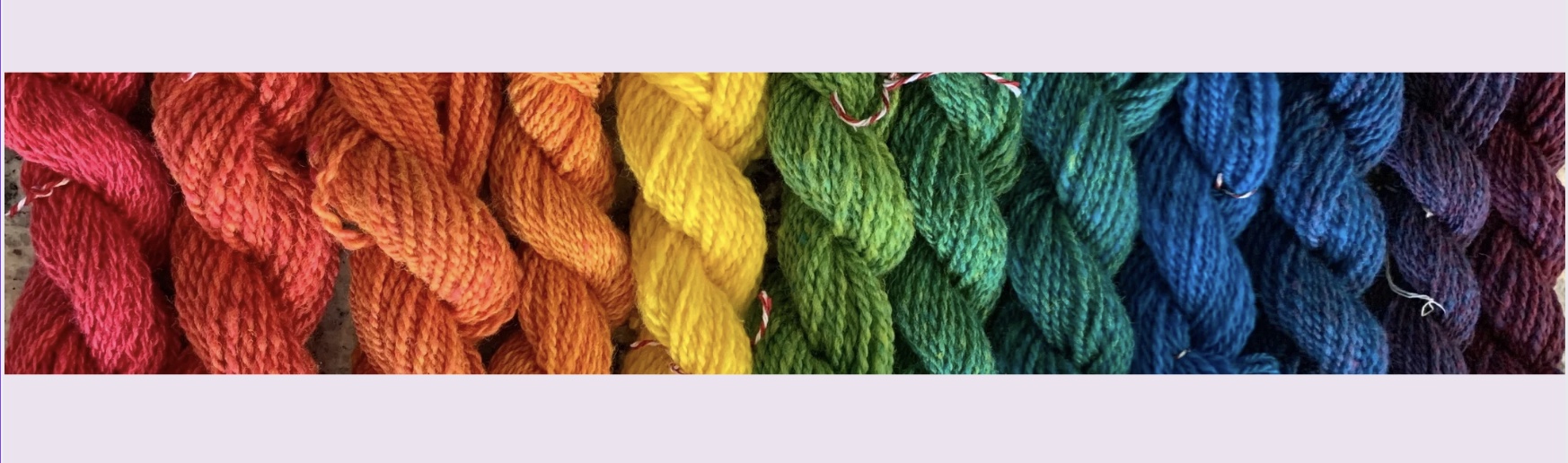
Color theory for fiber artists is at the heart of every creative project, whether you’re dyeing yarn, designing a mood board, or crafting a vibrant piece of art. But what makes certain colors work so beautifully together while others clash? The answer lies in color theory—a foundational concept that guides how we perceive, mix, and use colors.
Let’s break down the basics of Color and how it can elevate your dyeing projects and creative work.
What Is Color Theory?
Color theory is the study of how colors interact and the rules that govern their combinations. It’s both an art and a science, rooted in our perception of light and color. By understanding color theory, you can create harmonious palettes, evoke specific emotions, and bring your creative vision to life.
At its core, color theory revolves around the color wheel, a visual representation of colors and their relationships.
The Color Wheel: Your Creative Compass
The color wheel is divided into three main categories: primary, secondary, and tertiary colors.

1. Primary Colors: Red, blue, and yellow.
– These are the building blocks of all other colors and cannot be created by mixing other hues.
– In dyeing, these are often your starting pigments.

2. Secondary Colors: Orange, green, and purple.
– Created by mixing two primary colors (e.g., red + yellow = orange).

3. Tertiary Colors: Six hues, such as red-orange or blue-green.
– These are made by blending a primary color with a neighboring secondary color.
The color wheel is an essential tool for understanding color relationships and creating balanced palettes.
Color Relationships: Harmony in Action
Color relationships describe how colors interact on the wheel. Here are some key terms and combinations to know:
1. Complementary Colors:
– Colors opposite each other on the wheel (e.g., blue and orange).
– These combinations create high contrast and vibrant energy.
2. Analogous Colors:
– Colors next to each other on the wheel (e.g., yellow, yellow-green, and green).
– These palettes are harmonious and soothing, perfect for subtle, gradient effects in dyeing.
3. Triadic Colors:
– Three colors evenly spaced on the wheel (e.g., red, blue, and yellow).
– These combinations are bold and balanced, offering a dynamic yet cohesive look.
4. Monochromatic Colors:
– Variations of a single color (e.g., light blue, medium blue, and dark blue).
– These palettes are simple yet elegant, ideal for tonal projects.

Complementary Colors

Analogous
Colors

Triadic
Colors

Monochromatic Colors
Warm vs. Cool Colors
Colors are often categorized as warm or cool, based on their emotional and visual effects:
– Warm Colors: Red, orange, yellow.
– These evoke energy, passion, and warmth.
– In dyeing, they’re great for creating vibrant, attention-grabbing yarns.
– Cool Colors: Blue, green, purple.
– These convey calmness, serenity, and relaxation.
– Perfect for soft, soothing palettes.
Understanding the temperature of colors can help you set the mood for your projects.
The Psychology of Color
Colors have a profound impact on emotions and perceptions, which is why they’re a powerful tool in creative work. Here’s a quick overview of common color associations:
– Red: Passion, energy, and excitement.
– Blue: Calmness, trust, and stability.
– Yellow: Happiness, optimism, and warmth.
– Green: Growth, balance, and nature.
– Purple: Creativity, luxury, and mystery.
Use these associations to evoke specific feelings in your dyeing projects or branding.
Practical Tips for Applying Color Theory in Dyeing
1. Start with the Color Wheel: Use it as a guide to create balanced palettes for your yarns.
2. Experiment with Complementary Colors: These combinations can create striking contrasts in variegated or speckled yarns.
3. Play with Saturation and Value: Adjusting the intensity (saturation) and lightness/darkness (value) of colors can add depth and complexity to your work.
4. Use Nature as Inspiration: Look to flowers, landscapes, and sunsets for naturally harmonious palettes.
Mastering the Art of Dyeing Fibers
Understanding color theory is like having a secret weapon for your creative projects. Whether you’re dyeing yarn, designing a mood board, or creating art, the principles of color theory can help you craft harmonious, impactful, and visually stunning results. So grab your color wheel, experiment fearlessly, and let your creativity shine!
– Albers, J. (1963). Interaction of Color. Yale University Press.
– Itten, J. (1970). The Elements of Color. John Wiley & Sons. Color theory for fiber artists
– Birren, F. (1988). Principles of Color: A Review of Past Traditions and Modern Theories of Color Harmony. Schiffer Publishing.